Fince — An app for Financial Advisory.
Role
UX Researcher
Impact
67.8% Adoption Rate
Year
2021
Watch the carousal below for a quick process overview


Overview
In 2021, our survey on financial customer behavior revealed significant growth in financial advisors, but limited accessibility led to their underutilization
Here’s a quick Empathy Map based on 2 of the 12 interviews we conducted.

Customer Point of View
People are either unaware of the benefits of consulting a Financial Advisor or, majorly rely on family and friends for any advice related to finances.
Advisors Point of View
Finding clients as a freelancer becomes a hectic and tiring task, especially when establishing trust in the first meeting is a major challenge.
Challenge
Customers find it easier to connect with friends and family for financial advice, such as tax planning, investments, or stocks, rather than reaching out to a certified financial professional — primarily because the path to connect with an advisor is not yet well established.

Based on our 2021 research aimed at understanding financial customer behavior
Our Hypothesis:
If we simplify the user journey and educate people on the benefits of consulting a Financial Advisor, more individuals will feel confident and empowered to connect with a Financial Advisor independently, leading to increased engagement and better financial decision-making.
Work Process
Double Diamond Model

Qualitative Research
Interviews & Surveys
I developed two user personas—Financial Advisors and Common People—to understand their perspectives and emotions toward financial advisory. This served as a quick sanity check before brainstorming solutions.
We began by listing advisors and common individuals, sending formal invites for interviews. While participation was limited, survey results provided sufficient data to synthesize user patterns. Finally, we created empathy maps to identify shared behavioral trends for each group.

Product-Market Fit
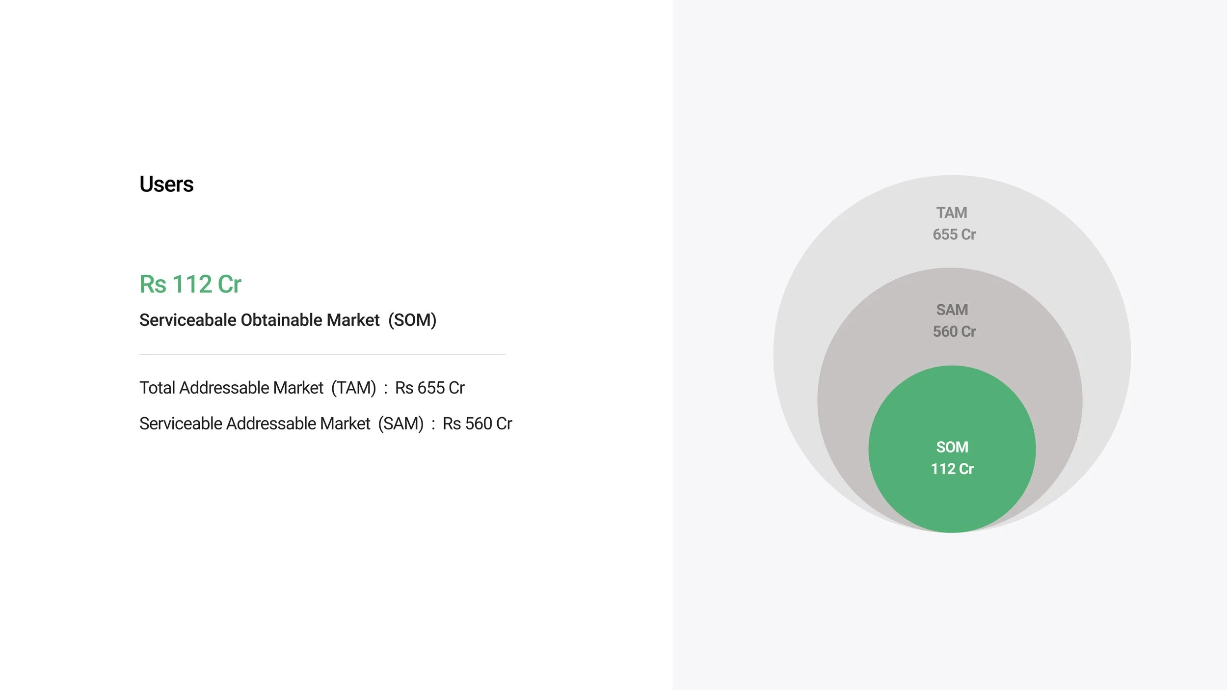
Calculating Market size
To test the product-market fit, we delved deeper into the financial market, calculating the TAM, SAM, and SOM.
Since AI models weren’t a thing in 2021, we did things the hard way. We analyzed the number of certified advisors (MBA graduates) produced over the past five years, calculated the annual average, and combined it with survey and interview insights to estimate how people engaged with financial advisory services.
To gather this data, we combed through internet articles and top university reports, compiling graduate statistics from across the country—North, South, East, and West. The accumulated data was extensive and highly convincing.
We cross-verified our numbers using reports from:
1) AICTE (All India Council for Technical Education)
2) UGC (University Grants Commission)
3) NIRF (National Institutional Ranking Framework)
4) IBEF (India Brand Equity Foundation)

User Behavior Mapping
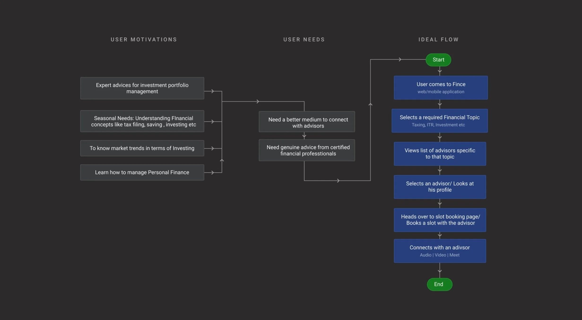
User Motivations & Needs
After conducting user interviews, engaging with financial advisors, and analyzing research findings, I created a quick map to highlight user needs, the underlying motivations, and how Fince could achieve them via an ideal flow.
Users face challenges such as understanding complex financial concepts, managing personal finances, and staying updated with market trends.
They require a user-friendly medium that connects them with trusted advisors for personalized guidance, addressing seasonal financial needs like tax filing, investing, and portfolio management.
Competitive Analysis
Existing Applications
For competitive analysis, we identified competitors that aimed at solving the same problem. Analyzed the steps taken to complete the primary tasks, understood the navigation structures, and went through customer feedback to identify points and areas of improvement.
Our target brands were Fiverr, FundsIndia, Scripbox, and Quickconsult. We performed a SWOT analysis to understand their application’s key weaknesses and later included those weaknesses in our app’s strengths.

Brainstorming
User Journey Flow
I created this on Miro to highlight how users feel at various stages of their financial journey.
This map provides insights into where to begin addressing key issues and where to conclude improvements.
User frustrations start right in the exploration stage and continue to increase as user struggles to find the desired result, so our primary focus is to start improving the journey at the exploration stage for better later-stage outputs.

Process Mapping
Flowchart
The flowchart outlines how navigation works on the application.
Starting from the home screen, users can explore promotional services, search for specific services, view all services, or directly access advisor profiles.
The journey progresses through service selection, slot booking, and payment of consultation fees, culminating in confirmation receipts sent to users via email or phone.
Simultaneously, advisors receive notifications and access their dashboards to manage bookings. This structured flow prioritizes simplicity and efficiency, addressing the communication gap between users and advisors while ensuring a user-centric experience.

Product Thinking
Minimum Working Flows
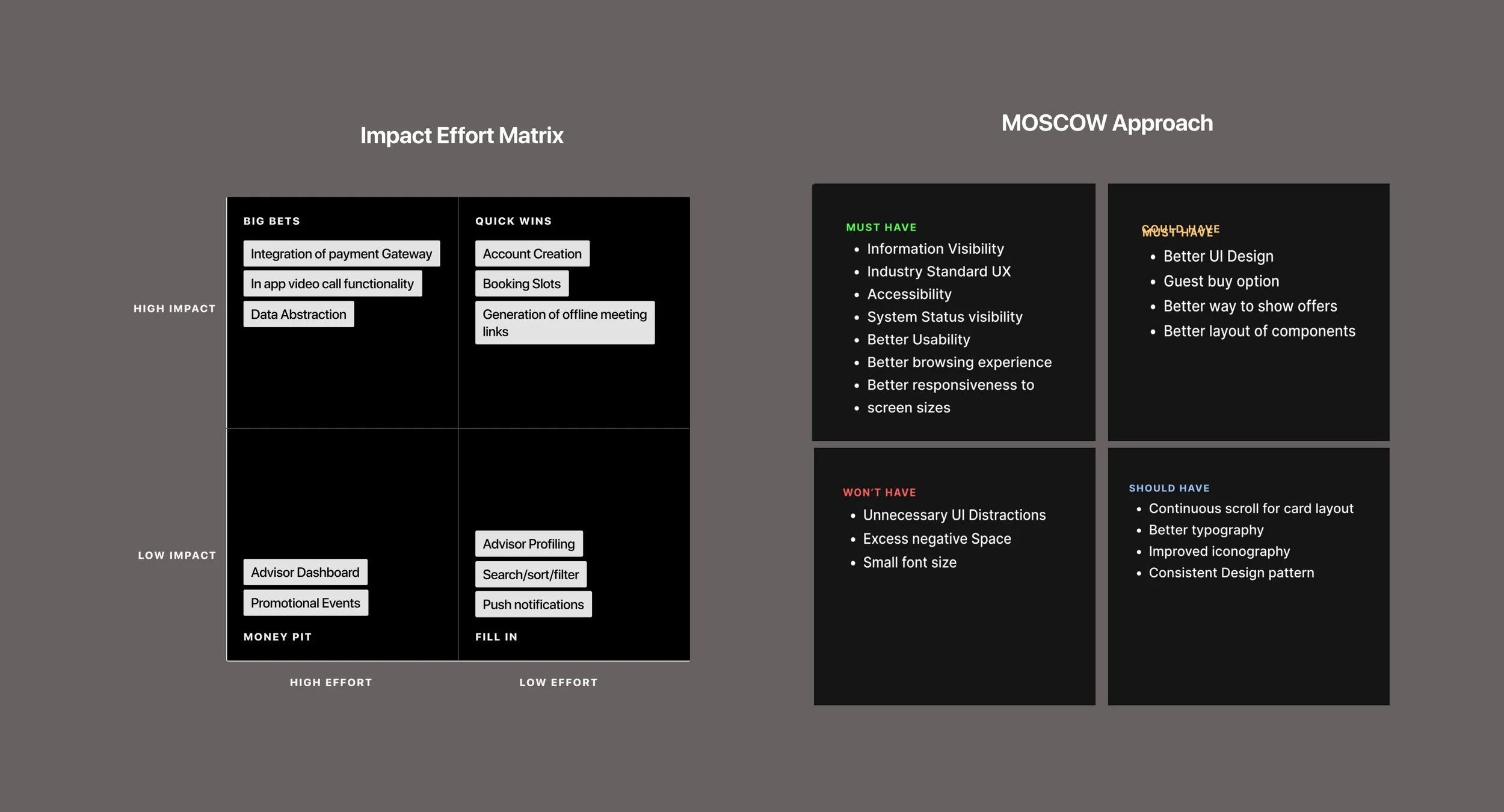
To define the minimum viable product (MVP) features, I worked with developers to utilize the Impact Effort Matrix and the MoSCoW Approach. We did this to balance resources in hand and the project delivery timeline.
The Impact Effort Matrix helped prioritize features by focusing on "Quick Wins" like account creation, booking slots, and generating offline meeting links, which deliver high impact with low effort.
Simultaneously, the MoSCoW framework categorized features into Must-Have, Should-Have, Could-Have, and Won’t-Have. For example, essential elements like information visibility, accessibility, and a responsive user interface were marked as Must-Haves, ensuring they form the backbone of the MVP.
Blueprints
Application Blueprint
Before jumping into wireframing the concept, I had a couple of meetings with the developers to understand the constraints and capabilities of the team, so that we all work in the same page to ensure features and functionalities I design would be incorporated in time and with ease.
Post discussion, I spent a few days designing the information architecture and how a user would navigate from one flow to another.
The following are the app wireframes I finalised. Some of them are designed quickly on a UI kit (top), and a few of them, which require some key details, are done from scratch (bottom)


High Fidelity Designs
Turning wireframes into a final app design having essential features for the Investor’s Pitch.


Prototype
Working prototype
According to my experience in the industry so far, an app that caters to users’ needs in each phase and helps them make decisions quickly has higher user retention.
Following Hick’s law and progressive disclosure, the app’s information architecture in the wireframing stage was kept standard and simple to reduce the learning curve.
Here’s a prototype to quickly see how the app worked.
Testing
Usability Test
The idea was to see how well our app had succeeded in answering the problem(s) it was trying to solve and how seamlessly a user could progress through them.
We created a usability guide and reached out to the participants who showed interest during the research phase.
I created a guide (right) based on experience and shared it with the team as a foundation for the usability test.
We collected test data (left) and noticed what took time, what went wrong, and what needed improvements.


Learnings
This project spanned several months and consumed a significant portion of my time.
What initially began as a research endeavor evolved into a realized application as we recognized its potential.
Despite my prior experience with a Fintech product at Kristal.AI, tasks such as sourcing participants, conducting interviews, and extracting valuable insights from feedback proved to be challenging tasks.
In reflection, a successful project hinges on a strong core team, and this picture depicts how happy we were while working on this project. We had just finalized the name of the application — Fince.