Automating Inventory Management
Led the end-to-end design for Tekion Store, a feature integrated into Tekion’s ERP platform that simplifies product discovery, order placement, and delivery tracking, significantly improving inventory management efficiency by 80%

Tekion — ERP Cloud Automotive Platform
Product Design, 2021 - 2022
I began my journey at Tekion as a Product Designer in Fall 2021, focusing on enhancing the customer experience of the ERP platform. Working within a fast-paced Agile SDLC environment, I collaborated with 6 Product Managers, 4 Designers, and 10 Software Developers to deliver several impactful product features, including a Pricing Tool, CRM, Support Portal, and Tekion Store.

Brief
The end-to-end cycle of issuing an automotive part order, getting a price estimate from the hardware store, negotiating the estimate, getting client signoff, and eventually delivery tracking was done manually by inventory managers on slips.

Challenges
The entire process was carried out by inventory managers, managing work across departments. With time, the team detected an increase in process inefficiencies such as unnecessary chaos during multiple bulk order & bill management issues.
Issues
(a) Chaos during multiple bulk orders
(b) Bill management Issues
Consequences
(a) Delayed order placement
(b) Frequent order delivery inefficiencies.
fig. Existing Manual Process Flowchart
Opportunity
Automating this cycle would not be necessary during the initial days of the organization when the automobile parts were required only a few times a month, but with growth, demand increases, thus with more clients and an incoming flux of bulk orders, maintaining such systems required more than manual labor and order sheets.
We saw this as an opportunity to set up an automated process, eliminating manual involvement to improve order management processes.
1. Setting up an Automated Flow
(a) Automatically trigger alerts when inventory hits a threshold.
(b) Connect suppliers and warehouses through APIs to streamline procurement. and track delivery.
2. Eliminating Manual Involvement
(a) Reduce dependency on employees manually updating inventory.
(b) Minimize human errors in data entry and order fulfillment.
3. Improved Order Management
(a) Real-time tracking of orders from placement to fulfillment.
(b) Automated alerts and notifications for pending, delayed, or completed orders.
My Role
I joined in early - from gathering business requirements and conducting key research, to designing the tool in Figma and leading usability testing.
The success of my work largely relied on rapid prototyping and iterative testing sessions with the target audience, i.e. the Implementation and Inventory Management teams—through weekly meetings and syncs. These sessions ensured the feature we were building directly addressed their pain points and aligned with their day-to-day workflows.

fig. Work process
User Interviews & Task Analysis
We initiated the need-finding qualitative research via direct user interviews with the target audience to understand their current workflow, pain points, and goals related to inventory management.
After user interviews, we performed task analysis to break down their key tasks ( e.g., updating stock, placing bulk orders, and generating bills) to identify the key roles and process workflows to be included in our solution.
Connect to see detailed Research Findings
-
Participants
Warehouse managers, Implementation Managers and Inventory Management Head.Sample Questions
Which tasks feel repetitive or inefficient?
What are your primary challenges when managing inventory?
What features would make inventory management easier for you?
-
Objective
Understand how users perform specific tasks to achieve their goals. By analyzing each step, we identify inefficiencies, pain points, and areas for improvement in the workflows.
Data CollectedSteps users take.
Tools they use.
Pain points, errors, and workarounds.
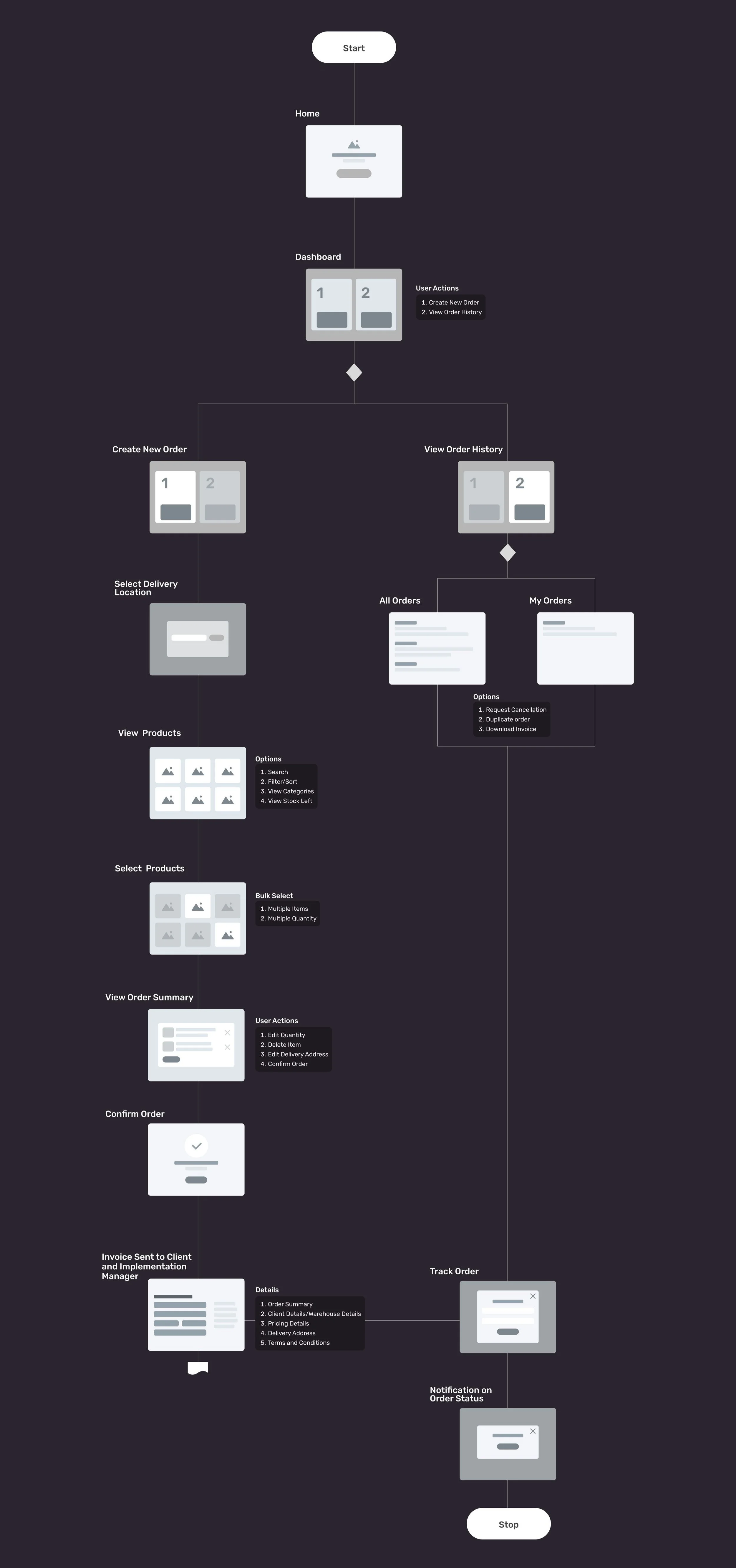
Proposed User Flow
After several drafts, we finalized the following workflow for the primary use case - placing an order. Eventually transformed it into a website mind-map to better understand the structure and interactions.
By mapping out the flow, I was able to determine where critical actions, user inputs, and confirmations should be handled through modals rather than separate pages. This approach ensures a smoother navigation experience, reduces unnecessary clicks, and maintains user context.
Understanding User Psychology - Eye Movement
Users typically scan, not read, so the layout included visual anchors to immediately highlight and prioritize key content. Elements like contrast, size, whitespace, and alignment influence where the eye goes first.
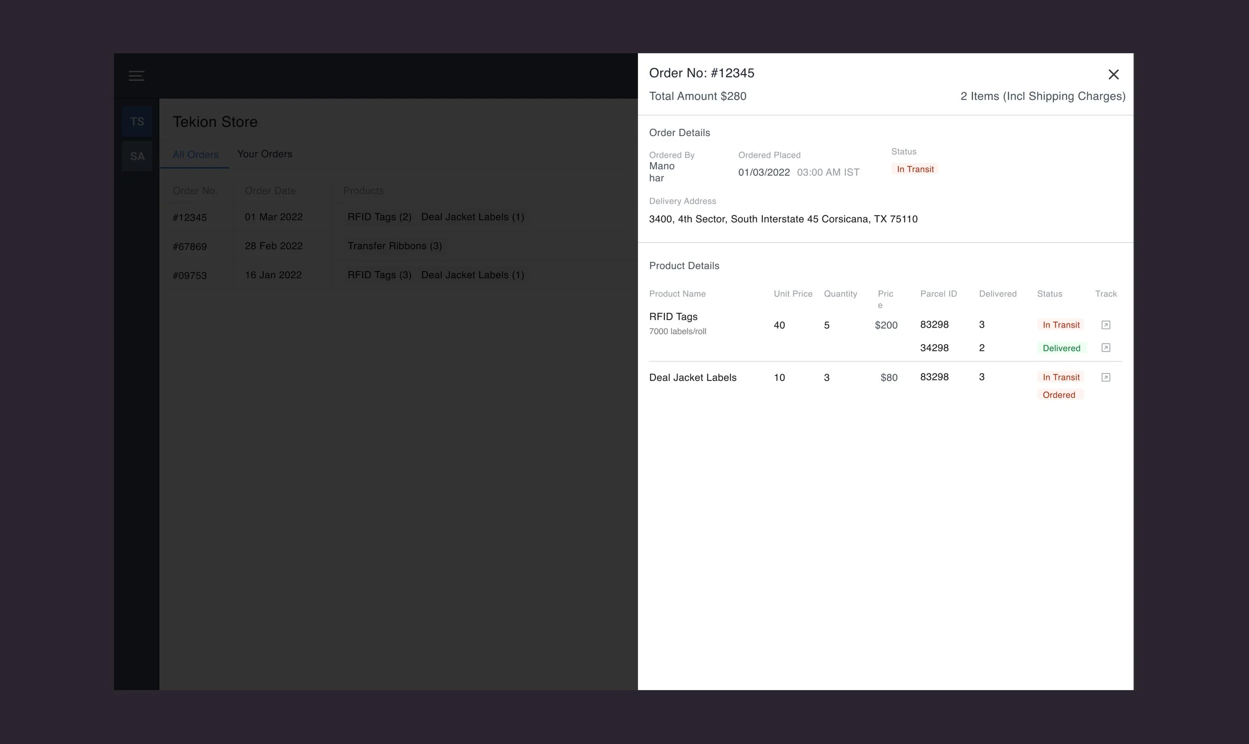
The idea was to divide the page real estate into an 80/20 ratio, 80% for the product list and 20% for the cart, which needed to be open and on-screen all the time, based on the stakeholder feedback.
Reduced Cognitive Load
Inventory Managers handle multiple orders during their shift and need to “quickly juggle” between the product list and the cart to confirm the right item in the right quantity.
First-time User Experience (FTUX)
There will be new managers in the future, but the system remains the same. So keeping “scalability” in mind, the 80/20 layout division makes the entire portal “easy to understand” and decide what to do next.
Quick Completion
Since the managers would handle multiple orders in their shift, placing the order should be in a “few clicks” and “fewer navigation patterns” to speed up bulk orders.

Understanding User Psychology - Information Architechture
Out of all the different typographic and layout combinations of the card designs, the one that created a balance between “not too much” and “not too little” was selected.
No Imagery
Not all product listings in every inventory management system include product pictures, and uploading them on the portal “wasn’t a required attribute” while creating the product object.
No Description
The inventory managers are familiar with the different products as part of their job. On a busy day, they don’t have time to read through descriptions. So “descriptions didn’t add any value”
Heavy layout requires minimal components
Since the page layout is already busy with too much data, it's best to keep individual components as simple as possible, including only the information “relevant for decision-making”.


Understanding Developer Constraints
All pages of in the project was designed on the 8-pt grid on Figma. This requires changing the nudgeValue=8 in Figma preferences.
Each block of component including the space element, margings & padding was defined in multiples of 8 and stacked upon each other like components to create the final layout.
Developer Handoff
The 8-point grid system aligns with common development frameworks, reducing the need for custom spacing and making “implementation smoother.”
Consistency Across Components
The grid ensures uniform spacing, padding, and alignment, leading to a “uniform user experience” throughout the product, & also “minimizes inconsistencies.
Scalability
It aids “responsive design” by allowing scaling across multiple screen sizes, enabling adaptable layouts that maintain usability & aesthetics across “various breakpoints”

Design Rationale - System-wide
The design was not visually heavy, but significant thought went into understanding user psychology and how target users would interact with it in their daily workflow. The goal was to enable them to complete the order placement task as quickly as possible while minimizing the learning curve.
Minimal Cognitive Load
Efficiency & Quick
Developer-Friendly Implementation
Simplified Data Presentation


Usability Testing with Stakeholders
To test the solution with users, we picked up the most common use case, which was discussed during our interviews with them, and performed the following steps:
Step 1
Created a working prototype for the end-to-end flow as described in the Use Case
Step 2
Conducted Guerrilla Testing workshop with the same research users as participants
Step 3
Asked them to complete the entire flow without asking for help
Step 4
Observed where they stopped and what made them stop.
Step 5
Did a similar exercise with multiple random participants
Step 6
Mapped the most common issues and prioritized
Step 7
Redesigned the few aspects of design, eliminating hiccups in the flow
Sample Guerrilla Test Setup
Use Case
Placing an Order
Primary Actor
Inventory Manager
Preconditions
Primary actor detects shortage of Inventory items
Goal
To place a bulk order as quick as possible with the right items and correct deliveryaddress
Triggers
The primary actor should know the exact details of the parts to be ordered
Prototype setup for the Guerrilla Test
Results and KPI Monitoring
Primary KPI
Order Placement Process
Secondary KPI
Employer Satisfaction
Project Status
Implemented
Impact
80% Improvement
Impact
eNPS score = 45 (High)
Timeframe
2 Months