Design System & User onboarding flow revamp.
At Kristal.AI, I structured a design system for their Financial Advisory Platform. To test the new design system, we launched an improved user onboarding flow, and it was a success. Post onboarding flow success, the entire app was transitioned to the new design system.
Role
Lead Product Design
Impact
40% Improved Customer Conversion
Year
2020


Background
For the design system, not only did we have to cater to the existing 15k+ users, but also extend the application to users who would skip the essential processes like KYC and risk profiling during onboarding.
My approach included structuring the component design system on Figma, based on Atomic Design principles, and eventually testing the system by fixing the user onboarding flow for the mobile application, utilizing the Mobile-first Design Approach.
Understanding the Challenges
Two key challenges we faced were team alignment and managing continuous changes.
Ensuring a smooth transition from documented designs to actual implementation required unanimous approval from all stakeholders, including the engineering, product, and design teams.
Blockers during implementation are inevitable in any design system transition. With new edge cases and features emerging in weekly sprints, refining components while maintaining backward compatibility proved to be a demanding task.


Internal Deadlines
As a solo designer, balancing the development of the Design System with rapid UX work was challenging due to limited time. The Design System needed to scale quickly as new use cases emerged, requiring constant rethinking and expansion of the library. To tackle this, I adopted a strategic approach to ensure efficiency and scalability.
Collaboration
Collaborating with the Head of Product and Front-End Engineers, I set clear short-term and long-term priorities. Rapid scalability and modularity became my guiding principles. I focused on reusable components approach to layouts whenever possible.
Discovery Excercises
Using real data instead of placeholders allowed me to address real world scenarios in the designs
What if the card titles go over 1 line?
What if a provider doesn’t have a logo?
What states of buttons are being used?
The Foundations
First task was selecting the typography and color palette. I shared a few options with the leadership team, aiming to create a modern and vibrant brand while considering the emotional state of the Target Audience. The platform needed a tone that felt like helpful guidance and coaching, not something that added more stress to already overwhelmed users.
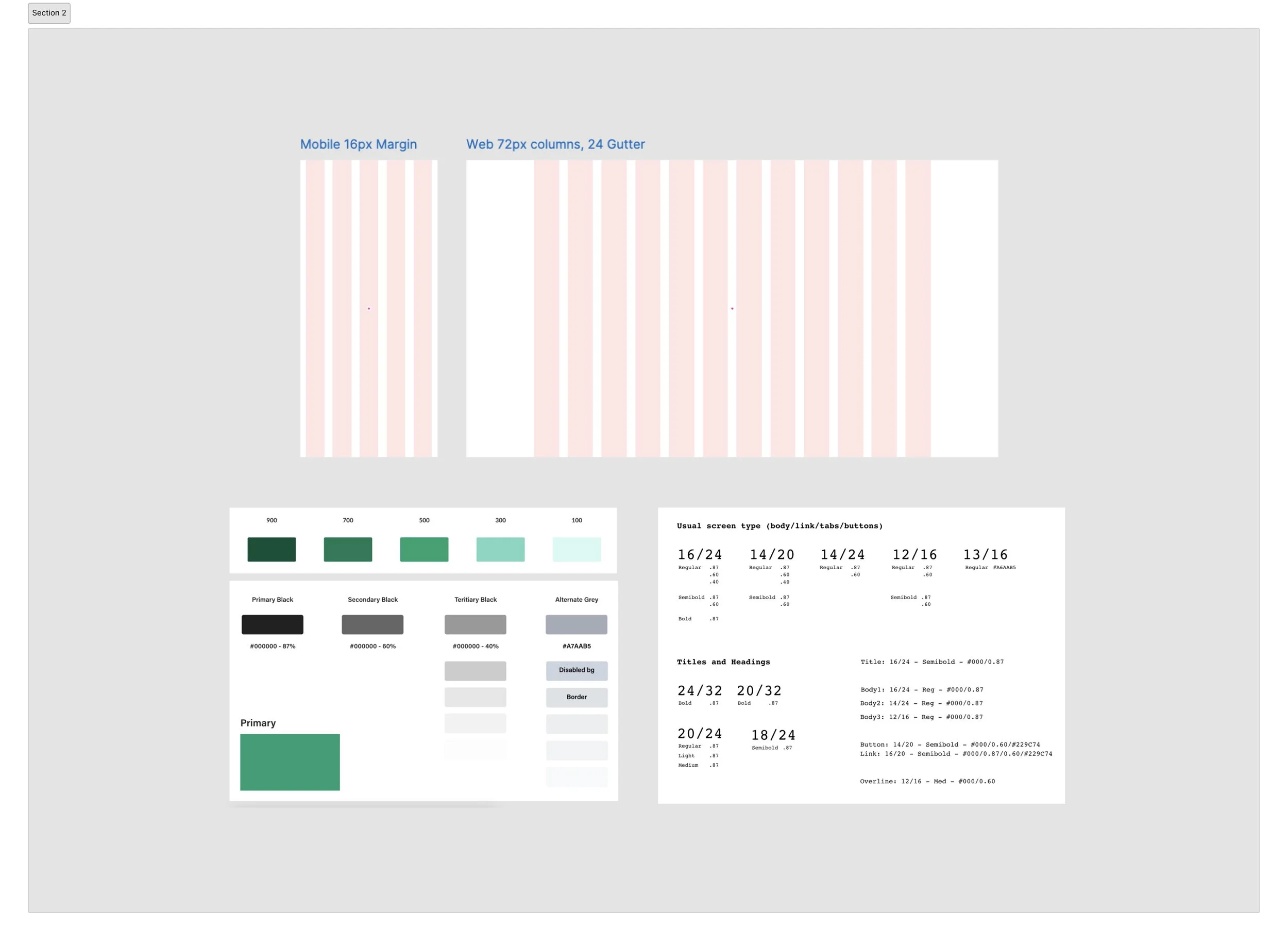
Next, I focused on building the foundation with a set of page templates. Drawing from the best UX practices, I explored different approaches to information architecture, navigation, and bottonsheets. Partnering with the front-end engineers, we mapped out a grid for key breakpoints, aligning it with their Tailwind CSS setup.
Atomic Design Framework
The next step was getting started on the component structure, guided by the Atomic Design approach. Continuously working with developers, I made sure that naming conventions and component organization worked for both sides.

Designing components on the 8pt grid
Industry standard is to design on an 8px grid to make the designs adapt to different viewports seamlessly. Also, If you’ve ever shopped online, you’ve experienced hesitation when you click purchase and the credit card entry form looks different from the rest of the site. A little consistency goes a long way.
The 8px grid system uses increments of 8 to size and space out the elements on a page. It means that for any defined height or width, margin or padding will be an increment of 8.


Accessibility Check
Building a Design System from the ground up allowed me to embed accessibility into the process from the start, rather than treating it as an afterthought.
Key principles included:
Verifying color contrast across different backgrounds and interaction states. For this I used WebAIM.org
Ensuring appropriate font sizes and touch targets for mobile users. For this, I used Figma Mobile to test UI layouts in real-time.
Adding text labels alongside icons for mobile navigation.
Maintaining consistency across layouts and similar UI elements.
While there’s always room for improvement due to time constraints and necessary trade-offs, this approach sets a strong foundation. It ensures that accessibility remains a shared priority and a key part of our mission moving forward.

Documentation
A set of components is not enough to maintain and sustain a Design System, there needs to be enough context to make it accessible to future employees, which is why,
I provided rationale behind my design decisions (in conversations with the Leadership team)
Showcase behaviours, interactions and various states via prototypes
While we had weekly syncs. with the Product and engineering teams, there was not enough time to discuss all the interaction details. In a fully remote team, my handovers consisted of contextual notes in Figma files, video walkthroughs of specific interactions, or more complex flows.


Results
In a couple of months, the design system was fully operational, with new features seamlessly launching through the updated framework.
One of the notable impacts was the approx. 30% time reduction, in the overall design to development to testing pipeline. The consistent and repeating components made it easy to design several interfaces in lesser time without worrying about the layouts or design intricacies.
I personally delved into a lot of industry-standard documentation, applied those best practices to my work, and watched as a design system evolved from just an idea to a fully functional and scalable framework.
fin.